Hello Panda people!
I've been on a month long hiatus. I was in the Greater Los Angeles, CA area for about 2 weeks staying with my boyfriend's family while we scoped out the living area and the job opportunities and just overall the public transportation and the vibe from the little boroughs that make up LA. We hit up Pasadena (our personal favorite), Hollywood, Universal City, Culver, Noho, Reseda/Sepulveda, El Monte, and LA.
Had some MANY great eats while we were there. Made sure to visit as many local eateries as possible. Even tried some vegetarian chinese food. THat was. . . interesting. LOL. Walked around ALOT.
We hit up Hollywood and saw the Chinese Theatre and then went to Madame Tusaude's to goof around w/ some celebrities.
We toured the campus of USC and UCLA, town rivals. Pretended to be students while spying on their beautiful university grounds. Was stunned by the size and amount of SPACE the students get and the scenery! I attended the small college of RCAD, so there's like no comparing my campus to these universities. OH YEAH! & we got to see some professional Real Madrid soccer players on UCLA before they went to practice for their game against the LA Galaxy. THat was really cool! :]
My cousin, Kris, showed us this FANTASTIC secret garden atop a hill called Barnsdall Park (i think that's what it was called) that had a perfect, less foggy view of the Hollywood sign, and some FRESH FRESH air flowing (which is like a big deal in LA), and trespassed and took pictures in and around this stone mansion that was on top of the hill.
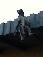
We made sure to check out some local art scenes.
I took in the lively LA city scene complete w/ dead cockroaches, cool billboards, and do not piss on tree or dirt signs. :3
Checked out Little Tokyo, ate some AWESOME ramen, made some wishes on the tanenbaum tree, and ate some DELISH yogurt w/ cute lil sanrio spoons.
By the end of the trip we were PRO MASTERS of LA public transit system. And we bought some awesome parting gifts for my boyfriend's family for putting us up for two weeks w/ awesome home cooked meals every night! ;]


And if you all MUST know I HAVE been doing some work, despite my long reprieve of posting. lol. I finally got some feedback on the Chibi's Boba logo. SOOOO. . . the verdict is colors are fun but redo the drawing of the boy & girl as per the original because they want the characters to look more young and SIMPLIFIED. Alright now I'll admit now, but please keep this hush hush, trade mistake secret. I submited these revised sketches along WITH the color studies. BIG NO NO! Wanna know why?? Because now I have to edit/redo those color studies along with new ones AND redraw the characters. I should have submitted the revised sketches in FIRST before going on ahead w/ colors for approval. Now I have more back tracking to do and catching up to play and more UNNECESSARY work to do, because I got too excited and went on ahead anyways w/ colors before having the sketch approved. LAME. & shame on me! Now I get to pay for my minor mistake w/ my time and to my annoyance, more effort than orginally planned. Le SIGHS. Well, it's a learning experience at least. And learn from this I SHALL! Because mistakes like these are stupid, pointless, cost TOO much time that clients, bosses, and companies cannot AFFORD to redo, and it's more stress and worry on my part that could have been avoided had i had more patience.


ALAS, we move on to some MORE exciting work that's in the works. These are some WIPs of some character and accessory development sketches I am doing for a potential client for a children's book. I can't release much more information until I, myself, receive more information, and I ACTUALLY land the job. Most important part of this is that i GET chosen to illustrate this book. THUS i need to make these look AMAZING and turn them into him by tomorrow night or Sunday morning at the latest. WISH ME LUCK! ;]
These have been so much fun and so colorful and I have discovered that I would LOVE to do more of these. I have previously not been such a big fan of Photoshop painting, I'm a more vector art naturalist. I enjoy solely focusing on shape and color and I find that personally when I force myself to focus on JUST the shape and color of a shadow, line, silhouette of a character or prop, it's much easier for my brain to compute and logistically understand what I'm doing. When I'm on Photoshop, I tend to focus on details first, big picture/blocking in comes second and I get lost in my values and the colors/shapes become undefined and muddy. BUT, I have always found myself to enjoy oil painting and I have discovered a new way to approach my Photoshop painting akin to oil painting. I downloaded some new brushes, stole some old ones from my boyfriend, and instead of painting w/ my default watercolor process I usually did with digital painting, I started w/ my oil painting principles -- which for you non-artsy people reading,
OIL: starting with shadows and darks first, middle tones, and building up to your lights/highlights last.
WATERCOLOR: starting with the lights and washes first, and then building up the mid-tones and lastly the shadows.
The point in starting w/ your dark to mids first is so that you can evaluate your values and structure first. You can't have color w/o light. VALUES are solely black and white, so you can only use light and shadows to relate to mass and shape. Once light is applied, you can add color according to the VALUES or how black, grey or white a shape is. Long winded answer, hard to grasp but simple once you know it concept.
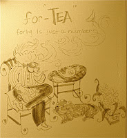
And last but not least are some very few sketchbook drawings I did while in CA. While riding the public transportation buses and subways in LA I came to notice that old people who ride the buses and wait in the hot sun at the bus stops and walk from place to plac are really STRONG. I saw so many old folks in LA that just looked more fit than I am! I was amazed and awed and I loved their spunk. I'll be doing some photo sketches of these ppl and characters soon. I'll show you guys when I do. But seriously. . . old LA-ers, man. They're tough. LOL.
I was just carrying around my sepia toned brush tipped markers. I find i like keeping sketchbooks simple and only use value, little color. I want to work on imcorporating more color into my sketchbooks but the small mole skin sketchbooks I am using righ tnow don't really take to watercolors that well, they slip right off. Seems the paper is coated and thicker, better for use w/ acrylics and gummier materials like crayons. So I'll be carrying my karon d'ache crayons and my trusty water brush pen in my bag w/ me to try to incorporate some simple color.
Love, Erica.
p.s. Sorry for the long post. I know most of it was fluff and photographs, but well, Photoshop has been giving me so much grief tonight that I had nothing else to do but write about why I haven't been writing these past 3 weeksish. Pardon all the jargon. But I hope you enjoyed this post. Come back for more because this week will be bus and filled with art! :D Good night!


