
Anyways, it's been a trip doing the process work for this one little logo, but I think we've come to a conclusion. Listen to your illustrator/graphic designer. They know what they're doing/talking bout since they're been trained for exactly what you're asking them to do. That being said, here's the gist of all the process work I did for this logo. And I'm quite happy w/ the results. :]

So it all started from this little page in my sketchbook. This is where the idea for the logo and mascots came from. ^^;; All big things come from small beginnings right? :]


Then I mocked up the sign and my initial sketch into a hanging sign/poster format that can be seen in the shop window and outdoor greeting sign. And after I busted out a round of mascot options. Some "CHIBI" characters.


And of course, I had to do some sign mock-ups w/ the mascot. And after looking them over my cousin and his team chose the 20's flapper couple.


I came up w/ some final sketches w/ the boy and girl. And then I proceeded w/ some experimental color mock-ups.


I think I went a lil' overboard. But I honestly was open in my direction with color and style. The shop concept was still very basic and this logo was going to be the jump off point to what the style, decoration, and interior decoration for the shop. So I tried to draw inspiration from other bubble tea shops and more of a retro color palette from old movie posters and old video games covers. But I knew it wasn't working out quite how it was supposed to. I got too caught up in the little details of the drawings and made it too complicated. It was no long "CHIBI" and I got feedback from my cousin's team saying they wanted the boy and girl to be cuter/younger looking. More SIMPLE, and less complicated. I admit, that's one of my fault, I tend to get caught up in the tiny details and have to stand back to see the bigger picture often.


So after that I started on the basic type development because the store needed the store sign soon, they signed the lease and were getting antsy.

They came to me after saying they wanted to try something new w/ the mascot. So I came up w/ a bubble tea cup after looking at some pics of other game company logos that my cousin showed me.

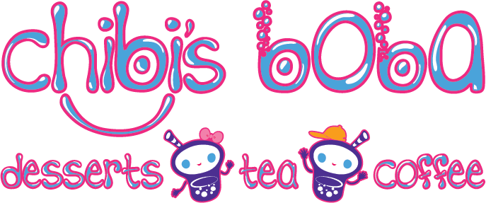
And after a little tweaking I came up with these guys. :] Meet "Chibi" and "Boba".


So once I got the type set I explored with making it a big more dimensional and I really enjoyed making them look "bubbley" for bubble tea.


I did a bunch of color palette options and in the end they liked the first colorway I made. :D Classic complimentary color scheme. :] A few tweaks here and there and VOILA!

Here's the final product. And I'm still working on more designs and sprucing up the vertical design with the boy and girl.
But I've got a bunch load of projects I've been working on this past August that I have yet to post about. And I've got a couple projects I'm doing with some potential clients. So I hope you guys stop by to check those out in the coming weeks! :D
Love, Erica.
P.S. I'm giving away a free limited edition watercolor painting to the 100th like on my facebook page. I will be posting up the finished painting up on my blog for all pandas to see. Spread the word and best of luck to the future 100th liker! XD Here's the link to my fb page @ https://www.facebook.com/PandaErica.
No comments:
Post a Comment